With the increase in usage of smart phones it’s becoming increasingly important to think about those users when designing websites. With that in mind I thought it was about time we redesigned our own website at Ehaus to make it more user-friendly across devices.
Despite researching mobile design I’ve done very little practically to develop CSS for mobiles. A light looking workload this month provided us with an opportunity to implement a mobile experience for the Ehaus website whilst providing us with a practical platform to develop the skills me will need going forward.
This wasn’t intended to be a redesign, and it most certainly isn’t, it’s simply a rethink of what we already have to make the website accessible across devices.
Navigation
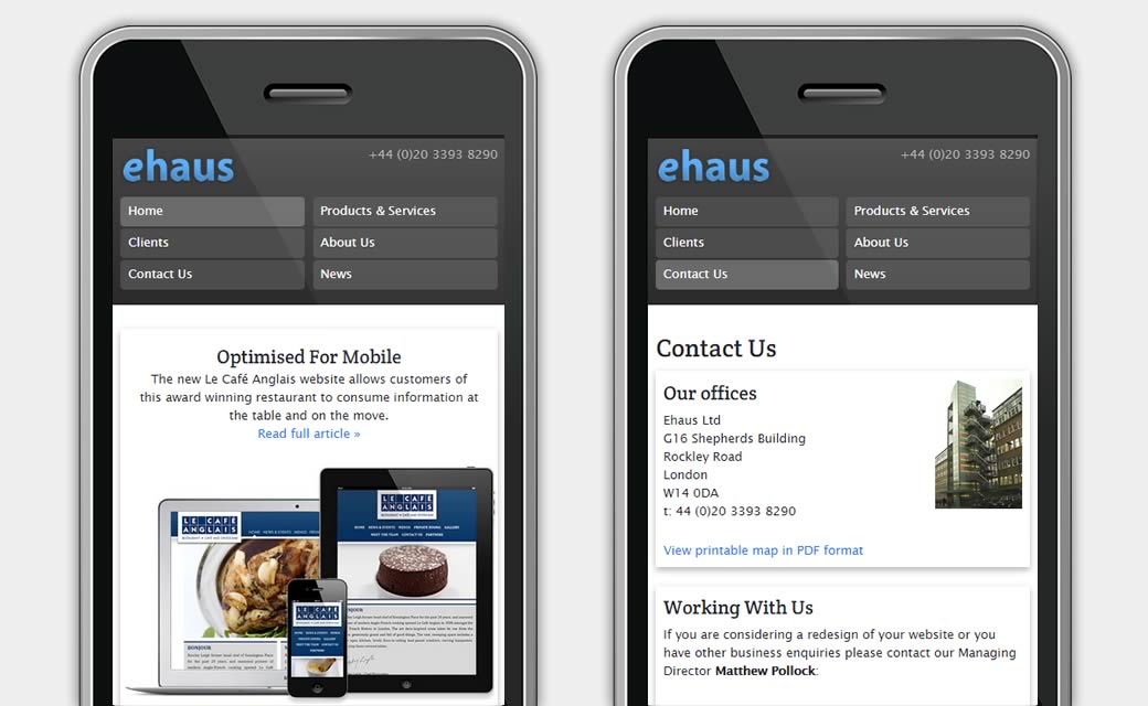
The first part of the design to tackle was the navigation which now has 2 states; the original tabbed configuration is retained for larger screens (although I’m now using CSS rather than background images for the tabs), but smaller screens now have a full width 2 column layout with a pill style design for the navigational elements.
This was pretty easy to implement, simply changing the positioning of the containing div as well as the widths, margins and border radius of each link.
Layout & Design
Whilst the overall layout and design of site has changed very little, I did have to make a few changes to existing elements to make them easier to adapt for mobile presentation.
One of the more prominent elements I needed to re-work was the home page banner. Originally the banners were full width background images with both image and text overlays, this layout proved difficult to present effectively on small screens so a rethink was needed.
The result was to take a more modular approach so I chose to display a featured image, text excerpt and project category separately. This enables the design to be a 2 column layout on larger screens and a single column layout on smaller screens.
Content Flow
One of the issues I encountered with layout was the flow of content. Like many other websites many of our page templates consisted of a left hand column and a right hand main column. This is a pretty standard convention but presents issues when designing for mobile.
As mobile design is linear this layout would mean page content appears below category navigation meaning lots of scrolling to get to the content. For that reason I switched the side column from the left to the right hand side so it appears after the content in the flow of the page.
In Conclusion
On the whole I found this a rewarding experience and less daunting than I had perhaps anticipated. You do have to take a different mental approach to the way you conceive ideas and I found it easiest to consider the mobile layout first as this is normally the most pared down version, effectively progressive enhancement.
The main difficulties remain with browser support, as you might expect IE7 and IE8 are the main culprits and unfortunately until they are dead and buried those difficulties will remain.