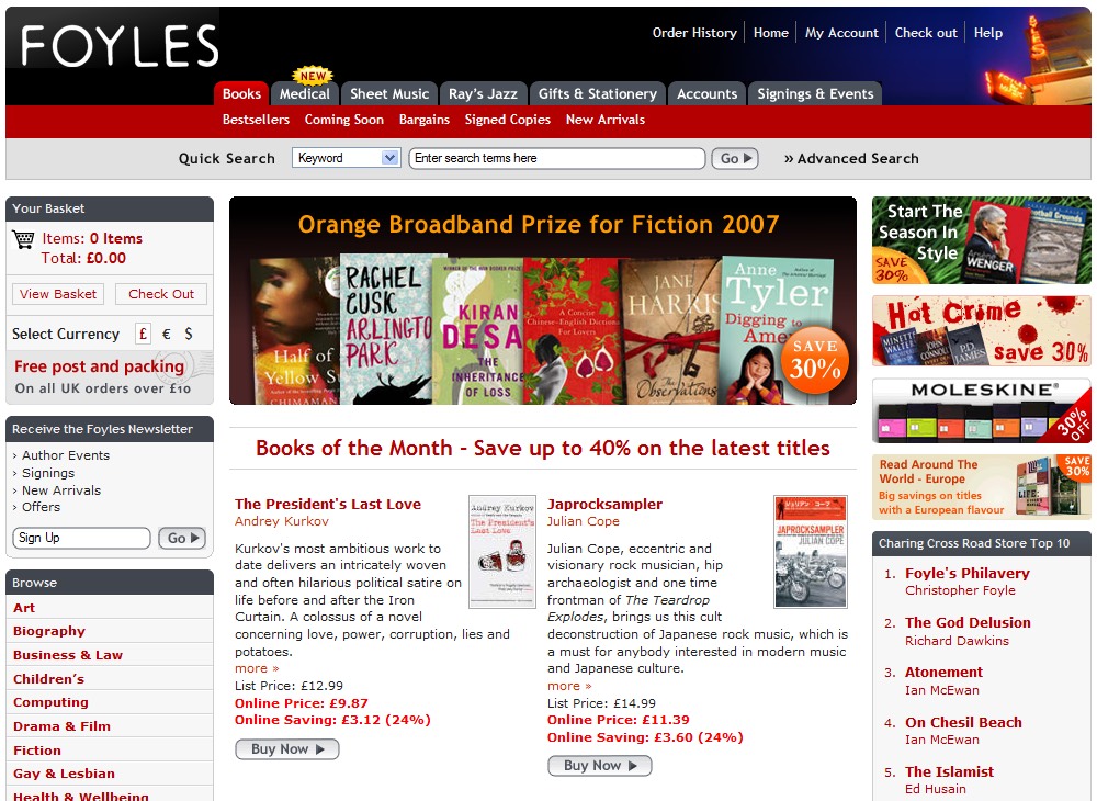
Just launched my redesigned e-commerce website for the bookseller Foyles who I also did a redesign for back in 2005.
I also created a number of graphics to for use as links on the home page banner and the right hand column which will be an ongoing process as special offers and featured items change over time.
We also created a number of mini-templates configurations for featuring products in various grids, these templates can easily be changed in the Content Manager by in-house staff.
The new site also features a jumbo footer with featured content, upcoming events and store information which are all now accessible throughout the website.
Lessons Learned
Despite only redesigning the site two years ago there were a lot of lessons learned by both us and Foyles in the time between launching the old design and developing this one.
One major thing that has changed in terms of the way we develop websites is that we have moved away completely from using tables to layout content, the new website uses only Cascading Style Sheets (CSS) for the layout of the design.
Whilst this has been a bit of a learning curve it has enabled us to do many things that were either very difficult or completely impossible before.
For example, quite simple things like borders are now generated by specifying this in the CSS, before we had to create borders using inline images. This new functionality makes it really easy for us to change colours, widths and sizes without the need for an image editor like Photoshop.
This also means the HTML is a lot cleaner although the CSS files are far larger than before and I’ve noticed many of my colleagues struggling with the more abstract nature of separating out the style from the content.
Personally I found the challenge of designing and developing this website a real thrill and look forward to implementing many of the thingsI’ve learned on future designs.
